Part 1 | Getting Started
CSS float layouts can be confusing to understand at first. The float property allows two or more HTML layout elements such as <div> tags to be aligned left or right or positioned side-by-side within a parent element. Floats are also used to align other elements such as List Items to create horizontal menus or to wrap text around HTML elements or images. Understanding floats is essential for being able to layout complex Web page designs effectively with CSS.
– “I failed on my way to success.”

CSS FLOATS
The Float Property
Float is a CSS positioning property that allows HTML elements to be aligned left or right and side-by-side within a parent element. Let’s use the CSS Box Model again to visualize floats. When an HTML element or selector has a float property assigned, it will align to the left or right edge of its parent considering any margin or padding assigned to both elements.
Floats provide the ability have two or more sibling HTML elements reside in the same horizontal space. In other words, two or more sequential <div> tags that are not nested within one another (siblings) can be floated left or right, or both left and right, to align them side-by-side inside a parent <div> tag or semantic HTML5 element such as a <section> or <article>.
Floats also allow for the horizontal alignment of <li> tags (List Items) to create horizontal menus and are useful for aligning images left or right inside a paragraph to create text wraps around pictures or other layout elements.
HTML Structure | HTML for Box Model 4
In this example, the <div> tags that define Boxes 1,2, and 3 are siblings of one another (not nested) and are all nested inside the parent <div> tag for Box 4.
Note: Box 4 includes a <br>tag after its text to prevent the text from trying to wrap around the first float.
<div class=”box-4-parent-element”>Box 4<br>
<div class=”box-1-float-left”>Box 1</div>
<div class=”box-2-float-right”>Box 2</div>
<div class=”box-3-clear-both”>Box 3</div>
</div>
Left & Right Floats | CSS for Box Model 4
A class selector and CSS property values to float a layout element left (and push off its parent element edge with the margin-left property) might include the following:
<div class=”box-1-float-left”>Box 1</div>
.box-1-float-left{
width: 110px;
height: 140px;
padding: 10px;
margin-top: 20px;
margin-left: 40px;
margin-bottom: 10px;
float: left;
}
A class selector and CSS property values to float a layout element right (and push off its parent element edge with the margin property) might include the following:
<div class=”box-2-float-right”>Box 1</div>
.box-2-float-right {
width: 110px;
height: 140px;
padding: 10px;
margin-top: 20px;
margin-right: 40px;
margin-bottom: 10px;
float: right;
}
The Clear Property | CSS for Box Model 4
Clear is the sister property to float. HTML elements that appear immediately after floats require a clear property to fall directly beneath floated HTML element(s) or selector(s) or they will break the layout.
The clear property has three possible values:
1. left = clears only left floats
2. right = clears only right floats
3. both = clears both and right floats
A class selector and CSS property values to clear both a left and right float might include the following:
.box-3-clear-both {
width: 260px;
height: 90px;
padding: 10px;
margin-right: auto;
margin-left: auto;
clear: both;
}
Note: HTML elements and selectors that have a clear property assigned cannot use a margin-top property. This is because it is also “cleared” and therefore collapses. Instead, the HTML elements proceeding (above) the cleared element are assigned a margin-bottom property to provide spacing.
Multiple Left Floats | CSS for Box Model 5
It is also possible to use floats to render multiple side-by-side sibling HTML elements (such as columns or thumbnails) with a single class selector. In this example, all elements float left and use the margin-left property to provide spacing from the left of each element starting from the parent element edge after the parent’s padding:
<div class=”box-4-parent-element”>Box 4<br>
<div class=”float-left”>Box 1</div>
<div class=”float-left”>Box 2</div>
<div class=”float-left”>Box 3</div>
</div>
.float-left{
width: 72px;
height: 140px;
padding: 10px;
margin-top: 20px;
margin-left: 20px;
float: left;
}
Advanced Clear Methods
There are instances where the clear property will not provide the desired result including:
- Applying floats to multiple rows of columns or thumbnails sharing the same class selector.
- HTML element content wrap around a nested HTML element with a float property assigned.
There are a few advanced methods to clear multiple floats:
- A “clearfix”pseudo selector class can be applied to the HTML element proceeding the element to be cleared:
.clearfix:after {
content: “.”;
visibility: hidden;
display: block;
height: 0;
clear: both;
}
- A <br> tag or empty <div> tag can be injected into the HTML to force the next HTML element to fall beneath the proceeding HTML element.
- The CSS overflow property can be assigned with a hidden or auto value to the parent element for a group of floated elements to clear succeeding floats. This requires another <div> tag to server as a parent container.
Note: for further details on floats and clears visit CSS Tricks by Chris Coyier at:
https://css-tricks.com/all-about-floats/
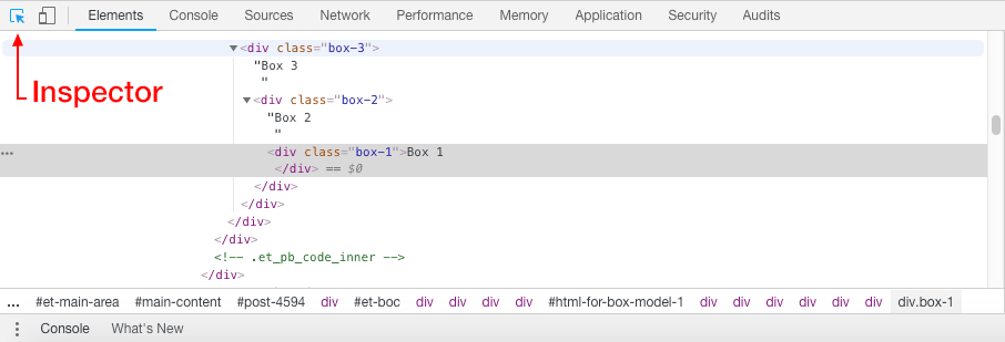
Browser Developer Tools | Figure 1
As previously covered, most modern browsers have Developer Tools to help you visualize float based layouts and associated margin and padding property values.
In Google Chrome, goto the View Menu > Developer > Developer Tools > Then, choose the inspector icon in the console and mouse over the elements you wish to examine in the browser window.
The Developer tools console also allows you to make code alterations to the HTML and CSS for that particular browser session. It does not change the code, it modifies your view of the code until a browser refresh. This is very useful to perform experiments live in the browser.
HTML for Box Model 4 | Floats Example 1
<!doctype html>
<html>
  <head>
    <meta charset="UTF-8">
    <title>Title of the document</title>
    <link rel="stylesheet" href="css-for-box-model-4.css">
  </head>
  <body data-rsssl=1>
   <div class="box-4-parent-element">Box 4<br>
     <div class="box-1-float-left">Box 1</div>
     <div class="box-2-float-right">Box 2</div>
     <div class="box-3-clear-both">Box 3</div>
   </div>
 </body>
</html>
CSS for Box Model 4 | Floats Example 1
@charset "UTF-8";
/* CSS Document */

.box-1-float-left {
 width: 140px;
 height: 200px;
 padding: 10px;
 margin-top: 20px;
 margin-left: 40px;
 margin-bottom: 10px;
 float: left;
 border: 1px solid #00ffff;
 text-align: center;
 background-color: #000000;
 color: #ffffff;
 font-size: 12px;
 font-family: Helvetica, Arial, "sans-serif";
}

.box-2-float-right {
 width: 80px;
 height: 200px;
 padding: 10px;
 margin-top: 20px;
 margin-right: 40px;
 margin-bottom: 10px;
 float: right;
 border: 1px solid #00ffff;
 text-align: center;
 background-color: #000000;
 color: #ffffff;
 font-size: 12px;
 font-family: Helvetica, Arial, "sans-serif";
}

.box-3-clear-both {
 width: 260px;
 height: 30px;
 padding: 10px;
 margin-right: auto;
 margin-left: auto;
 clear: both;
 border: 1px solid #00ffff;
 text-align: center;
 background-color: #888888;
 color: #ffffff;
 font-size: 12px;
 font-family: Helvetica, Arial, "sans-serif";
}

.box-4-parent-element {
 width: 360px;
 height: 360px;
 padding: 10px;
 margin-right: auto;
 margin-bottom: 0px;
 margin-left: auto;
 border: 1px solid #00ffff;
 text-align: center;
 background-color: #cccccc;
 color: #000000;
 font-size: 12px;
 font-family: Helvetica, Arial, "sans-serif";
}HTML for Box Model 5 | Floats Example 2
<!doctype html>
<html>
  <head>
    <meta charset="UTF-8">
    <title>Title of the document</title>
    <link rel="stylesheet" href="css-for-box-model-5.css">
  </head>
  <body data-rsssl=1>
   <div class="box-4-parent-element">Box 4<br>
     <div class="float-left">Box 1</div>
     <div class="float-left">Box 2</div>
     <div class="float-left">Box 3</div>
   </div>
 </body>
</html>
CSS for Box Model 5 | Floats Example 2
@charset "UTF-8";
/* CSS Document */

.float-left {
width: 72px;
height: 270px;
padding: 10px;
margin-top: 20px;
margin-left: 20px;
float: left;
border: 1px solid #00ffff;
text-align: center;
background-color: #000000;
color: #ffffff;
font-size: 12px;
font-family: Helvetica, Arial, "sans-serif";
}

.box-4-parent-element {
width: 360px;
height: 360px;
padding: 10px;
margin-right: auto;
margin-bottom: 0px;
margin-left: auto;
border: 1px solid #00ffff;
text-align: center;
background-color: #cccccc;
color: #000000;
font-size: 12px;
font-family: Helvetica, Arial, "sans-serif";
}Proceed to the next part of the guide if you feel you have a solid understanding of the topics covered so far. Review the related links to study these concepts in more detail.
Web Design Tools & Resources